
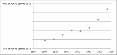
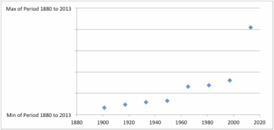
New! Test Yourself: Can you tell the difference between a graph of Earth's surface temperature and a graph of the Dow Jones (adjusted for inflation)?
Both graphs are 16-year averages through the latest available full year (currently 2013). For example, the data-points seen at 2013 are the averages of 1998-2013.
Feel free to leave a comment by clicking here. Thank you for your time and feedback.
