|
Thanks for responding!
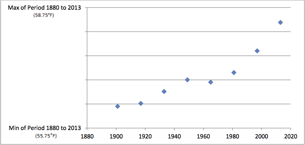
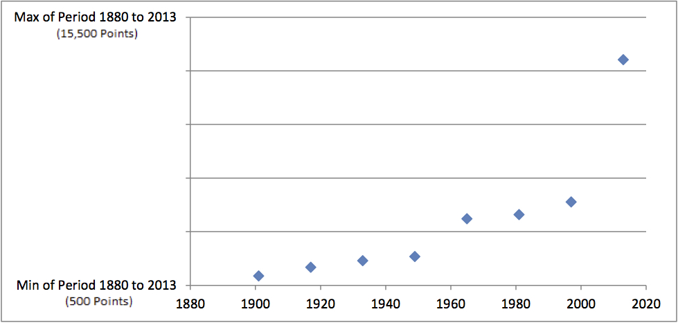
The graphs are shown again on the right side of this page, with additional information. The graph of Earth's surface temperature (using NASA data) is on top, and the graph of the DJIA-a (Dow Jones Industrial Average adjusted for inflation) is on the bottom. If you chose incorrectly, or were unsure of your choice, you're in the majority. Our studies so far show that (even financially sophisticated) people are just as likely, if not more likely, to choose correctly by flipping a coin rather than deciding based on the graphs themselves. Many people find these graphs compelling because they're so difficult to tell apart and so obviously increasing as functions. However, other people might, at least initially, believe that the DJIA-a has generally increased, yet they might hesitate to accept that earth's surface temperature has also generally increased. But how can one be increasing, while the other is not, if their graphs look so similar from the 1880's to today? By the way, if you are curious about why we used 16-year averages, it was due to the sawtooth-looking (or mountain-range-looking) character of both sets of annual data. Of course, such variability is why one ought to average further over time. After doubling the span period several times, and looking at 2-, 4-, 8-, 16-, 32- and 64-year span averages, we thought that the 16-year span graphs even out the sawtooth (variability) aspects well, while still offering a reasonable set of data points, thus giving us a sense of the trends over time. |
Earth's Surface Temperature (from NASA's annual data)
Dow Jones Industrial Average
Adjusted for Inflation |
Feel free to leave a comment by clicking here. Thank you for your time and feedback.


